RELIFE TORINO

RELIFE TORINO

Relife Torino is the new student apartment complex created by transforming the former Lavazza factory

MuseoTorino: the virtual museum of Turin, which we had already visited talking about Bicerin, tells about Lavazza in Corso Novara in Turin from 1965 until 2017.

Then in June 2018, the Lavazza Nuvola is presented. 

Inaugurated last week, Relife Torino is therefore a so-called redevelopment project curated by Turin architect Stefano Seita and studio Lombardini22 on behalf of a Swiss company: RELIFE Nation.

Relife bases its concept on the social economy through the RELIFE Foundation which has the ambition to contribute concretely to the improvement of society by ‘creating a bridge between the academic world and the third sector.’

The presentation campaign was curated by FUD Design, brand of Lombardini22.

Out of home logo including a QRcode depicted through urban floor graffiti curated by GreenGraffiti

It all sounds very nice.

But there is no shortage of controversy: the flats are rather expensive and certainly not affordable for all students.

The message was sent back to the sender again in the form of writing on the walls.

In your opinion, can we really talk about a better society if it is expensive?

While you tell me your student experience, shall we have a Lavazza this time?


ISY

ISY

Isy probably in someone’s mind represented a way of making the word easy, which by now needs no explanation, even more pop.

Three letters then, to sum up the English pronunciation and to introduce the next word: bank.

Three letters for the name.

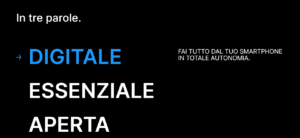
Three words for the slogan.

Digital

Essential

Open
It probably seemed natural in someone’s mind to shorten customer acquisition for this bank as well.

Why wasting time.

The bank is open.

Shouldn’t that be enough?

Essential.

So thousands of account holders, One none one hundred thousandby three again, have been transferred from what is considered the largest Italian banking group to this bank.

A digital and essential bank, where digital and essential means no more possibility of having a physical counter anywhere.

But also where digital and essential apparently means alerting unsuspecting account holders through a notification on the app.

Registered mail is extinct, and no more letters either, because in some papyrus of a thousand thousand lines written in small print the customer has signed that he “doesn’t want” any more paper communications.

No more phone calls, despite the fact that it is absolutely essential to have the phone for the infamous app and despite the fact that it is absolutely mandatory to communicate the number.

No more hassle or waste of time trying to contact the customer in one of a variety of ways, including email, texting, but also a trivial campaign of any nature.

No: it is an essential bank, in someone’s mind it seemed enough to send a simple notification within the app.

A notification of the kind that those who are Boomers, and lived through the days when the same people worked in the bank for years, people who could be trusted, do not tend to consider vital.

A notification that could have been missed by anyone.

A notification that constituted the only last resort, moreover with a deadline, to express not consent, but DISSENT to being transferred to the new Isy.

Find a “small” overview of reviews here

A parliamentary question was also asked about this forced transfer. 

Do you perhaps have direct experience to testify?

Among the fanciful narratives, it would seem that the choice of the lucky drawers fell on those who did not attend their reference branch.

I would really like to be able to see the selection mechanism … and in my heart I want to hope that older people are not involved … because maybe even they haven’t gone to the branch, an operation that has long since turned out to be almost as complicated as making an appointment with Chiara Ferragni.

But the new bank is OPEN …

1522

1522

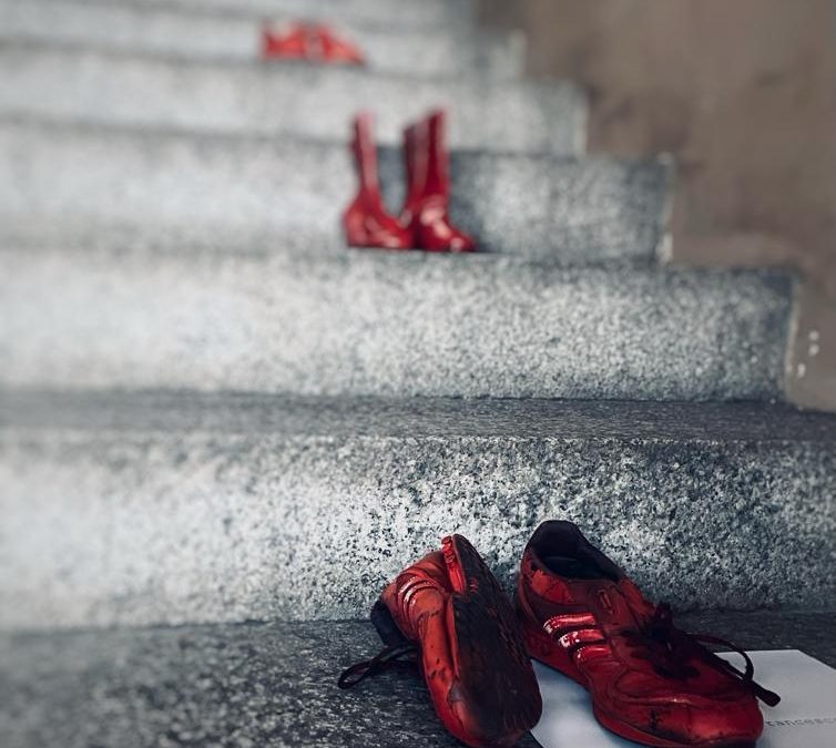
In the picture red shoes in Vigevano where various initiatives were organized on the occasion of the international day for the elimination of violence against women

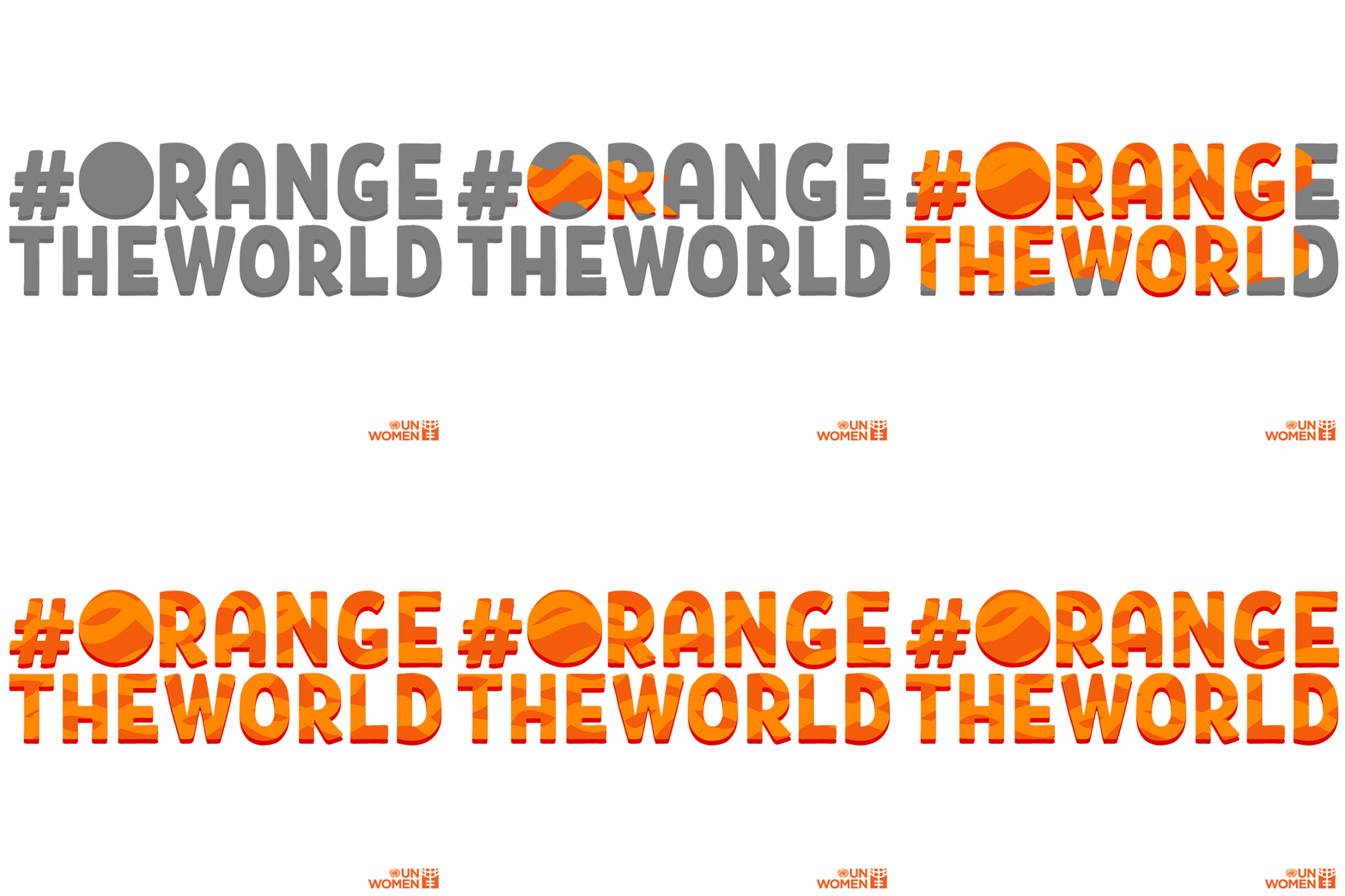
The theme of the 2021 campaign is #OrangeTheWorld.
Orange is the color to represent
a brighter future free from violence against women and girls, if you want you can share the gif or a personal picture of yourself with this color.

All very nice, but ten years have passed since Europe adopted the Istanbul Convention and in essence the situation is only getting worse.

The number of victims is terrifying, just as following the cases in the daily news leaves us stricken in the face of stories from which, to say the least, hallucinating circumstances emerge.

This is why I find it important to spread the number 1522 to contact the anti-violence line and I liked the idea of some stores to add it to the receipt, bags etc.

In case it is not possible to call, you can start a chat directly from the site

There are also many local associations that are a valid and efficient aid in the area.

The point where the mechanism jams is another and responds to the sad refrain “the laws are there, the difficult thing is to apply them.”

So I would say that since in recent days it has been amply demonstrated that, when the state really wants, in real time it carries out its intent, it would really be the case not to use two weights and two measures.

As my son’s teacher says “there are sons and stepchildren” or stepdaughters in this case, because we are all the same but some keep being more equal.

Archives

Pin It on Pinterest